I've been covering the Pac-12 and Ducks for many years now and typically shy away from really biased remarks about a member school's uniforms, but I usually do give a bit of opinion. Being the Dog Days of Summer and the midst of a pretty important shift in the Pac-12 in coming years, I figured it might be time to think about the Pac-12 for the first time since January. Now, don't get me wrong, there are no really bad sets in the Pac-12. Even my last place one would probably rank in the middle of other conferences.
So here is my completely subjective/biased top 12 list of Pac-12 uniforms in 2022 (really based on 2021 since there have been no major uni-news yet)

12. Arizona State: While I applaud their attempts, the combinations that have come out lately have been a bit garish. Maroon and gold are a good combo but not my personal favorite. And the sweatshirt heather gray just feels odd. I do like how they integrate the flag starburst into the look though.

11. Stanford: While I appreciate the simplicity of the traditional set, that is about all it has going for it. This is a visual ranking so the kinda simple red/white just sorta sits there. The away, all-white, is especially bland. And the black versions are just not all that exiting either. Maybe some pant or sleeve stripes might help. Utah is much higher in this ranking and they have similar color scheme but more details.

10. Cal: Oddly enough my critique of Stanford might be also applied here, but my main complaint with Cal is that they under-use of their blue/gold combo and tend to err on the side of too dark a navy blue and not enough yellow mixed with the navy. Their throwback set with brighter blue and gold is great.And I'm not a script logo lover, so would love a bear paw helmet or anything else besides the Cal.

9. Oregon State: Being an Oregon fan I love/hate OSU. But their uniforms of late have been real hit and miss. Too many mono-sets. At least they no longer use the "sports bra" color swatch on jersey, but I'm not a fan of the cream white. Nice wood texture on the numbers though.

8. USC: The main points they get are for tradition and being consistent. I like the brighter red/gold way better than ASU's similar combo.
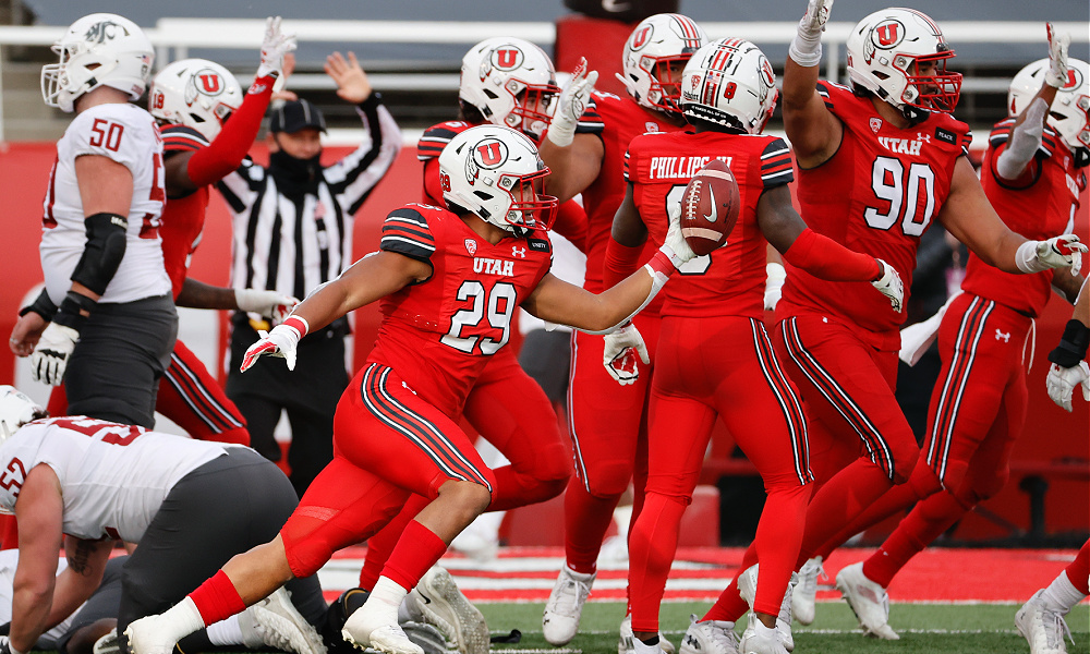
7. Utah: I want to like Utah more, but they are in the trap that Oregon was in a few years ago. They want to have fancy mix-match uniforms but make a few oddball choices just to show off. Black, white and red are a strong combo though.

6. Colorado: they quietly have had quite the nice rotation of colors but in a very restrained way. My only knock is that their versions of black/gold/gray can be a bit dull.

5. Washington: Purple is one of my favorite colors after green. But UW's purple can sometimes shift too far into navy blue.

4 Arizona: Last year they ditched the gradients and oddball fonts and went back to simple and elegant with reasonable mix-match of red, white, blue. This is what Stanford should try to do.

3. UCLA: Great bright colors and tradition. If they had a better alternate logo I'd say ditch the script logo, but it is iconic (more so than Cal)

2. Washington State: they have a great helmet logo and you might say their colors are like Stanford, but having two shades of gray as official colors just makes that combo really elegant.
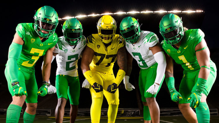
1. Oregon: I'm Duck fan for good reason. While I didn't like the "eggshell" look and too much "nightmare green," the classic bright green and apple yellow is one of the best combos in all of CFB. And their helmet rotation has matured to point of having several iconic designs that give the other bluebloods a run for the money.
No comments:
Post a Comment